Mistakes To Avoid In User Guide Templates
A clear and user-friendly user guide template helps customers feel supported, confident, and satisfied with a product. Get this wrong, and users will be lost, frustrated, and unhappy. Here are mistakes to avoid, so customers can always find the answers they need.
Missing the Basics
Skipping over basic steps is a common error. Some writers assume that users already know how to set up or navigate software. Customers get frustrated when instructions skip core steps. Always start at the beginning and walk through each step, no matter how obvious it may appear. Simple language keeps things clear. This approach ensures every reader, whether beginner or advanced, can follow along. The pain point here is that real people want quick solutions, not a scavenger hunt for missing pieces.
Using Too Much Jargon
Complex technical language and jargon stop customers in their tracks. When a user guide template includes industry terms without explanation, users will close the manual and look elsewhere (or give up). Short & plain terms make guides accessible to everyone. Important terms should carry a brief parenthetical explanation.
Poor Structure Hurts
A cluttered document, no headings, or a missing table of contents creates chaos. People need to scan, jump to sections, and find specific help fast. No one wants to scroll endlessly. Break the content into small sections with subheadings. Add bullet points for tasks and steps. A well-built guide turns confusion into confidence.
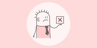
Skipping Visuals
People process images faster than text. Missing screenshots or diagrams stop users from progressing. Visuals show exactly what needs to be done. Use callouts, icons, and simple diagrams wherever possible. Don’t make instructions only text-based. A simple screenshot cuts down on confusion and calls to support.
Ignoring Accessibility
Every customer should feel empowered by documentation. Users with disabilities are put at a disadvantage when manuals do not consider
Screen readers
Colour contrast or
Keyboard navigation
You should add descriptive text to the images.
Outdated Content
Software, processes, and features change. When guides stay stuck in the past, customers get wrong answers and make mistakes. An outdated guide leads to complaints, extra support requests, and even product returns. Always keep documentation up to date. Update instructions with every new product release, feature update, or major bug fix. Regular reviews prevent confusion.
Information Overload
Trying to explain every possible scenario turns helpful guides into overwhelming walls of text. Include only information the user needs at the start. Note that group advanced topics are great. Another thing to keep in mind is that short & direct instructions keep the focus on solving problems.
Dr.Explain helps teams create clear & easy user documentation. Automatic screenshot capture & visual annotation keep guides simple yet professional. Besides, support for export in multiple formats or search makes Dr.Explain suitable for software teams.
Great documentation does not happen by accident. You should carefully consider knowing about the structure as well as accessibility. Timely updates transform user manuals into trusted resources. You must fix these common mistakes. Users will thank you with loyalty & fewer support calls. Learn more about how Dr.Explain streamlines the user guide creation process for maximum customer satisfaction.